← All work

[03]Brand · Advertising · Digital· 2025

Senior Market
/ miResi

Commercial design for a senior-care group in Spain. Mainly Senior Market — the brand manual, the advertising, and the UX/UI and web work — alongside its sister brand miResi.

Senior Market showreel: campaign creatives, posters, merchandise and web screens assembling on screen
Client
Senior Market · miResi
Industry
Senior care · Retail & marketplace
Year
2025
Services
Brand manual · Advertising · UX/UI · Web
Role
Brand Designer & Art Direction Support

[01]Overview

About the project.

A brand system for a category that usually settles for clinical — and refuses to.

01Brand manual & retail system
02Multi-format advertising
03UX/UI & web design
01 / Two brands, one group

Related, but not interchangeable.

Same person, different moments: miResi finds a residence, Senior Market sells what you take home. Shared green and tone, separate marks — a roof and hand for care, three figures for the counter.

Most of the work shown here is Senior Market. miResi is included because the two systems had to be designed to sit next to each other.

01

Senior Market

Senior Market logo: three white circles inside a green cloud mark above the wordmark

Retail. Mobility and wellbeing products, sold in store and online. Slogan: “A mayores retos, mayores soluciones.”

02

miResi

miResi logo: a green heart held in a hand under a roof outline, next to the miResi wordmark

Marketplace. Helps families find and compare senior residences — the moment before a product is ever needed.

02 / Brand platform

Written down before it was drawn.

The manual opens with the argument, not the logo — so every later call on colour, signage or ad copy has something to be checked against.

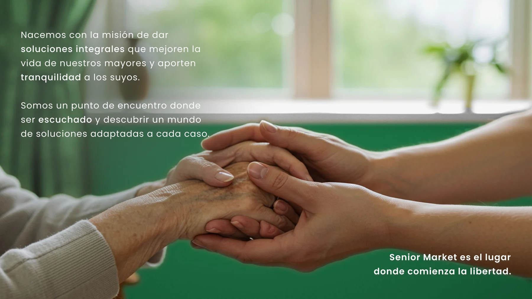
Mission slide: two pairs of hands held together over a green field, with the Senior Market mission statement in Spanish
Mission — integral solutions that improve older people’s lives and give their families peace of mind.
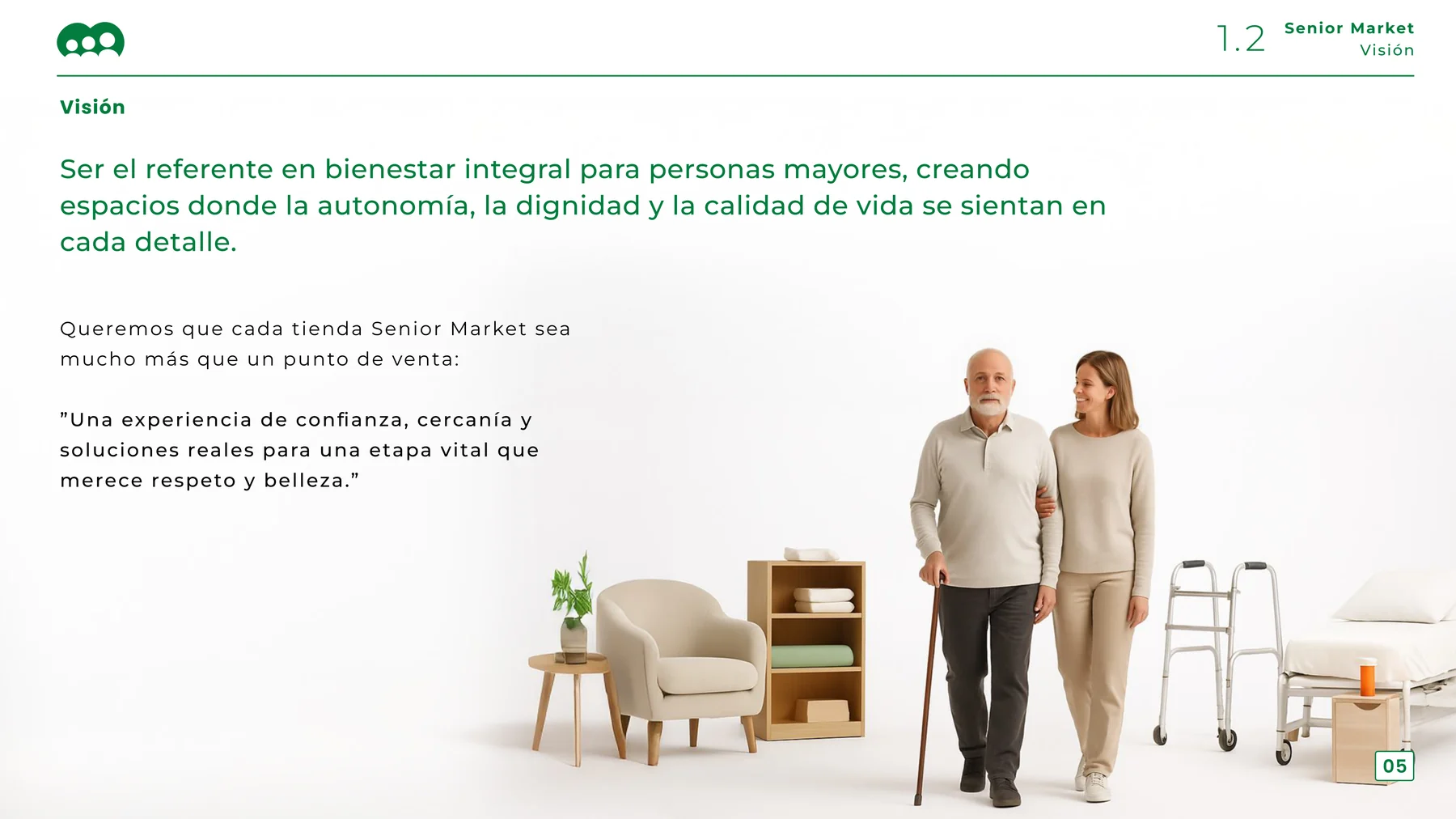
Vision slide: an older man walking with a cane beside a younger woman, surrounded by mobility products
Vision — every store as more than a point of sale: “a stage of life that deserves respect and beauty.”
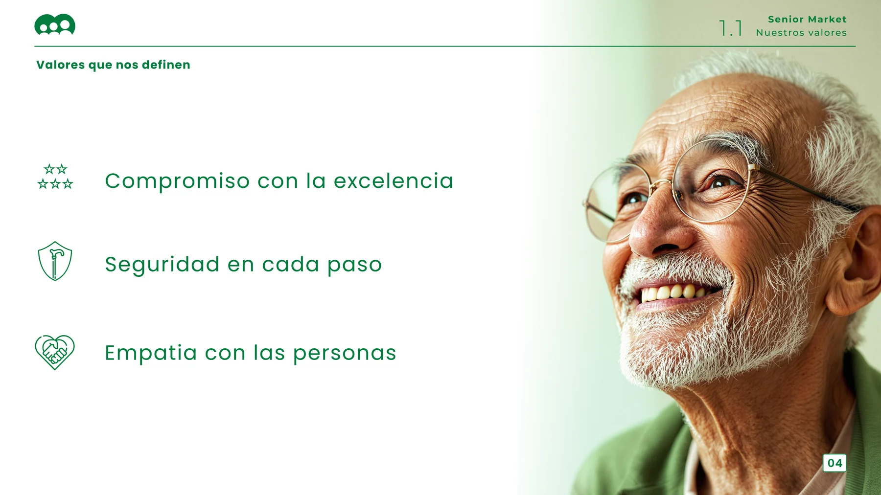
Values slide: three values with line icons beside a portrait of a smiling older man
Three values, each with its own icon: commitment to excellence, safety at every step, empathy with people.
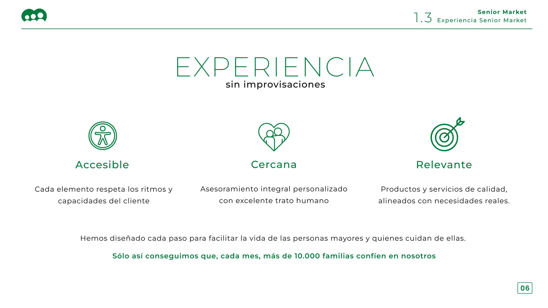
Customer experience slide: accessible, close and relevant, each with a line icon
The experience model — accessible, close, relevant — and the number it is measured against.
01

10,000+

Families trusting Senior Market each month — the figure the experience model is held to, and the proof point that leads the homepage.

02

9 chapters

From brand platform through design philosophy, retail space, signage, technology and staff training, to the customer experience itself.

03

2 typefaces

A geometric sans for the wordmark and headlines, Montserrat Semibold for the slogan and supporting copy. Nothing else is permitted.

03 / Identity system

Rules that survive other people.

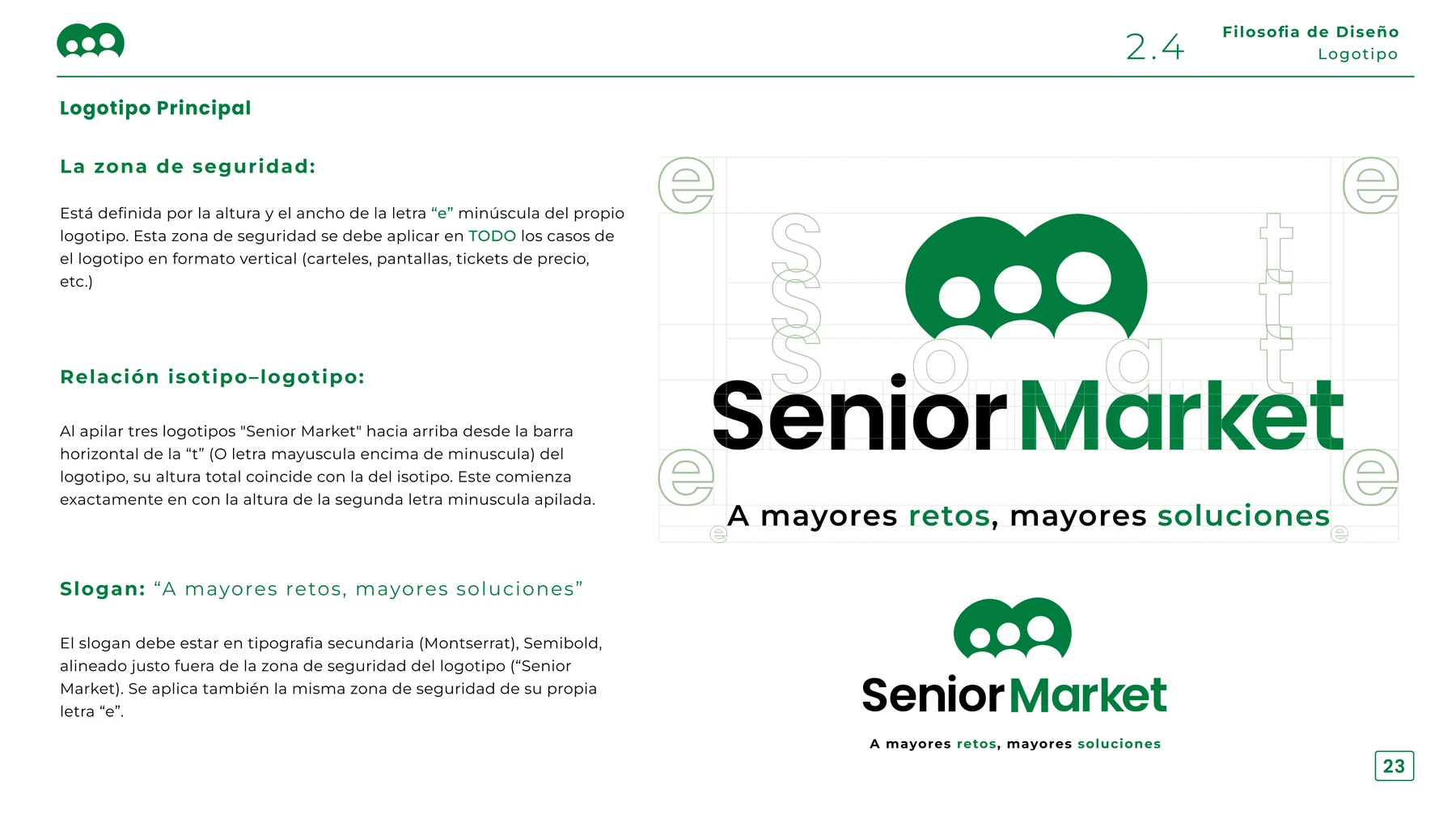
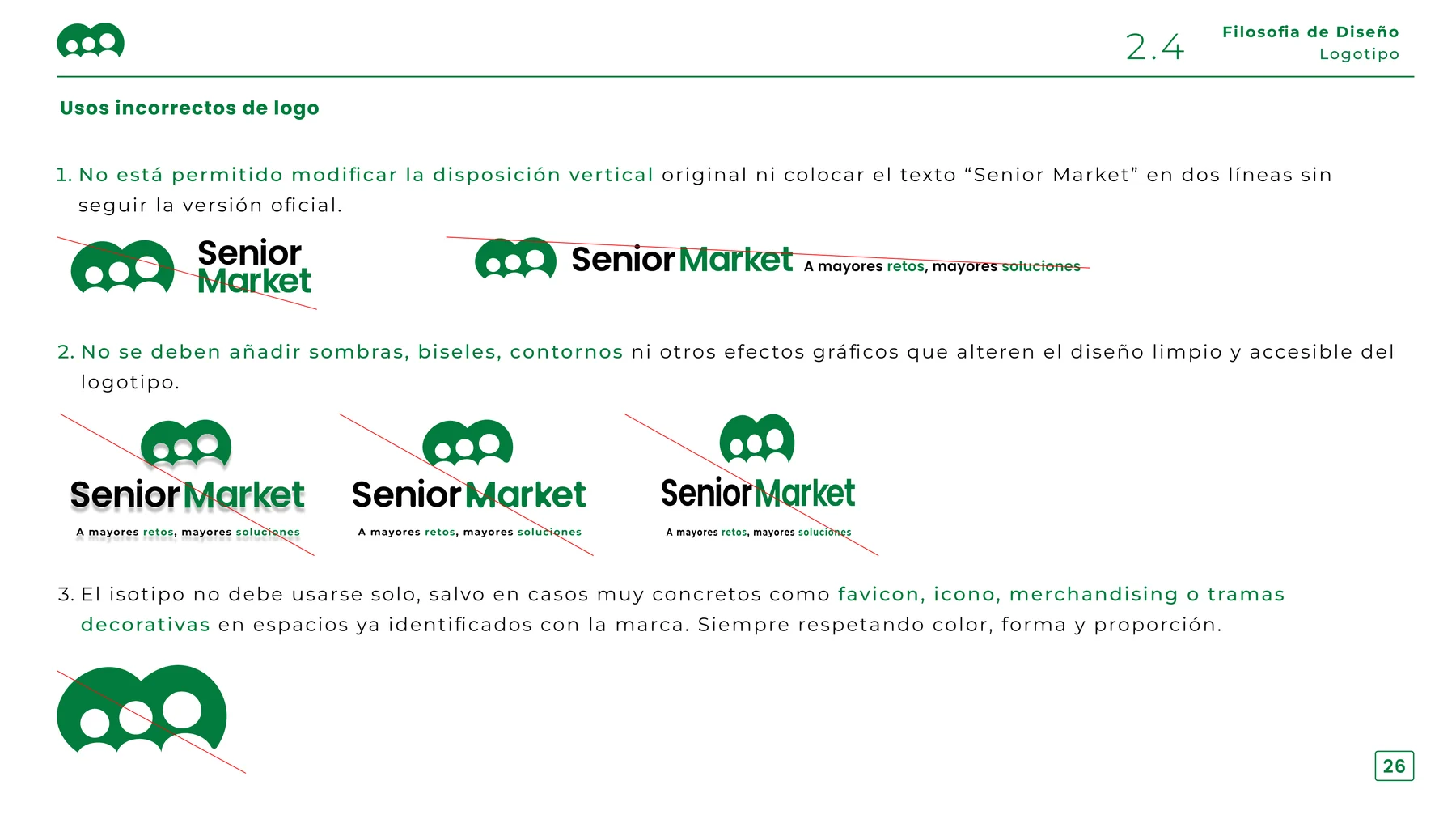
Clear space derived from the mark’s own lowercase “e”, the isotype–wordmark relationship fixed, and a full page on what not to do.

Logo construction slide showing the clear-space grid built from the lowercase e and the isotype-to-wordmark relationship
Clear space is derived from the logo itself, so it scales without a lookup table.
Incorrect logo usage slide showing struck-through examples of stacking, shadows and standalone isotype use
Misuse, spelled out: no restacking, no shadows or outlines, and the isotype alone only as a favicon, icon or merchandise motif.
03

Colour palette

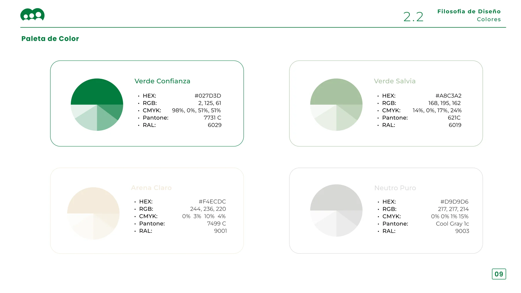
Verde Confianza#027D3DPrimary. Pantone 7731 C · RAL 6029
Verde Salvia#A8C3A2Secondary, calm surfaces. Pantone 621 C · RAL 6019
Arena Claro#F4ECDCWarm neutral, retail walls. Pantone 7499 C · RAL 9001
Neutro Puro#D9D9D6Ceilings, cool neutral. Cool Gray 1c · RAL 9003

Four tones, each specified in HEX, RGB, CMYK, Pantone and RAL — because this palette had to survive a print run and a shopfitter, not just a screen.

Colour palette slide showing four brand colours with HEX, RGB, CMYK, Pantone and RAL values
The palette page as it ships in the manual, with the full specification for every tone.
04 / Identity applied to space

A brand you can walk into.

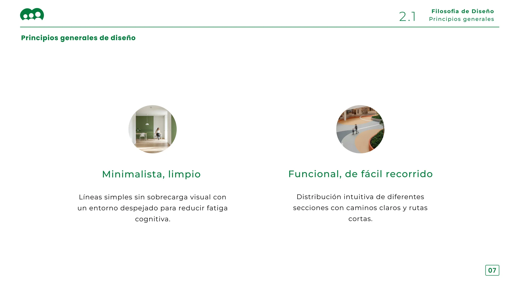
Retail is the biggest section. Two principles govern it — minimal to reduce fatigue, functional to move through — and every material answers to one of them.

Design principles slide: minimal and clean, functional and easy to navigate
The two principles everything else is checked against.
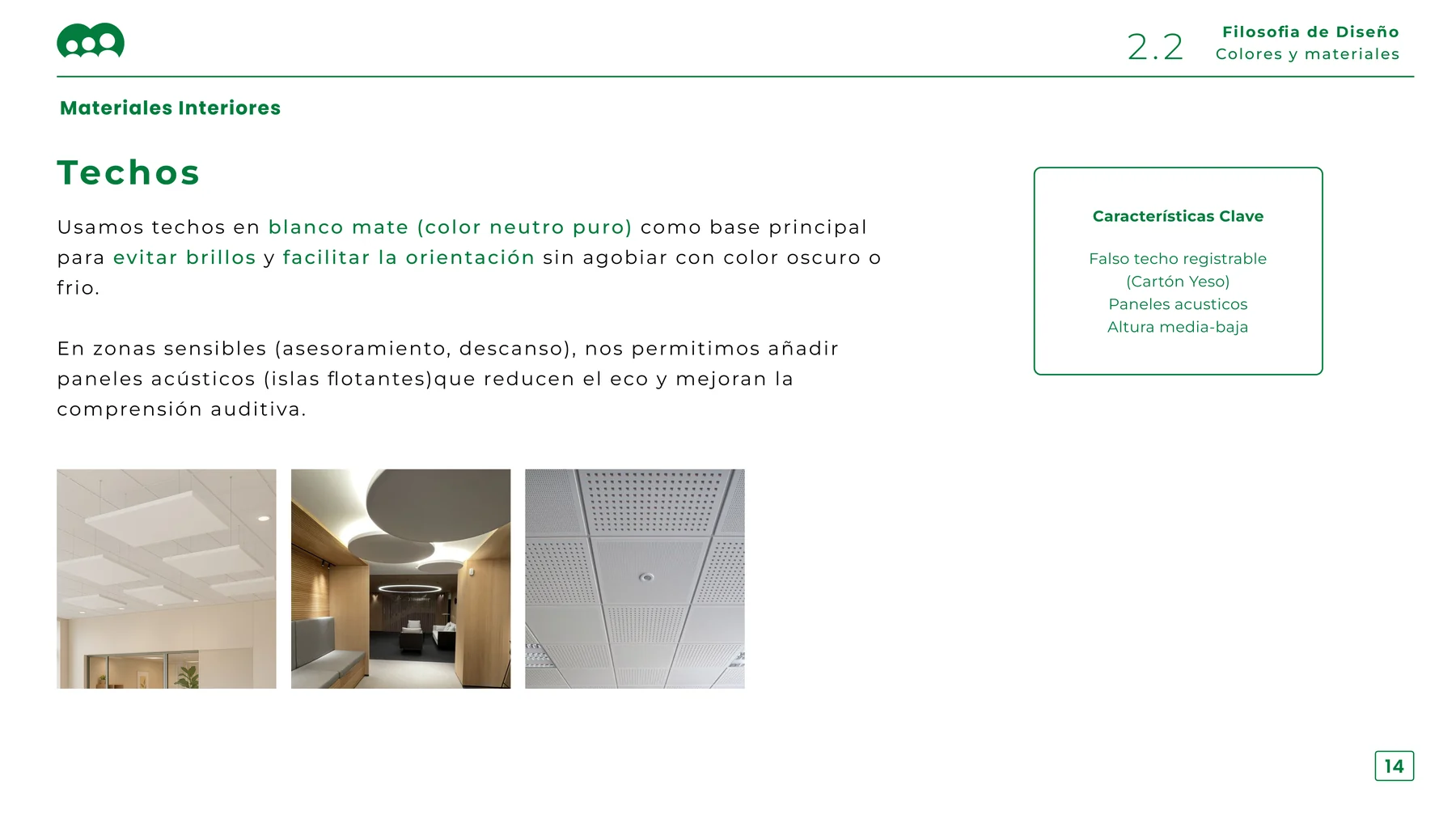
Interior materials slide covering matt white ceilings and floating acoustic panels
Ceilings: matt white to avoid glare, with acoustic islands in advice and rest areas so people can hear each other.
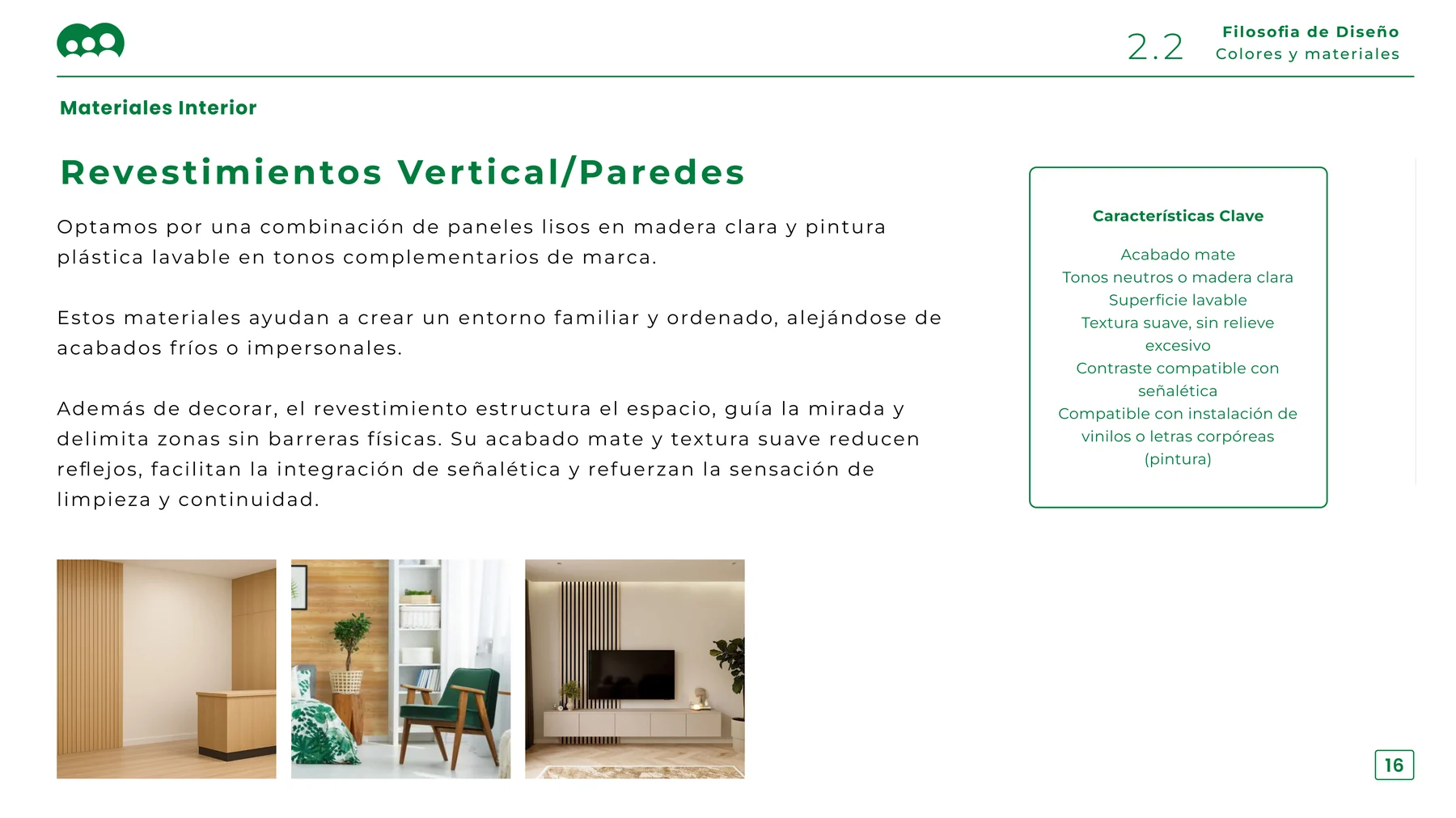
Interior materials slide covering wall cladding in light wood and washable paint
Walls: light wood panelling and washable paint, structuring the space and zoning it without physical barriers.
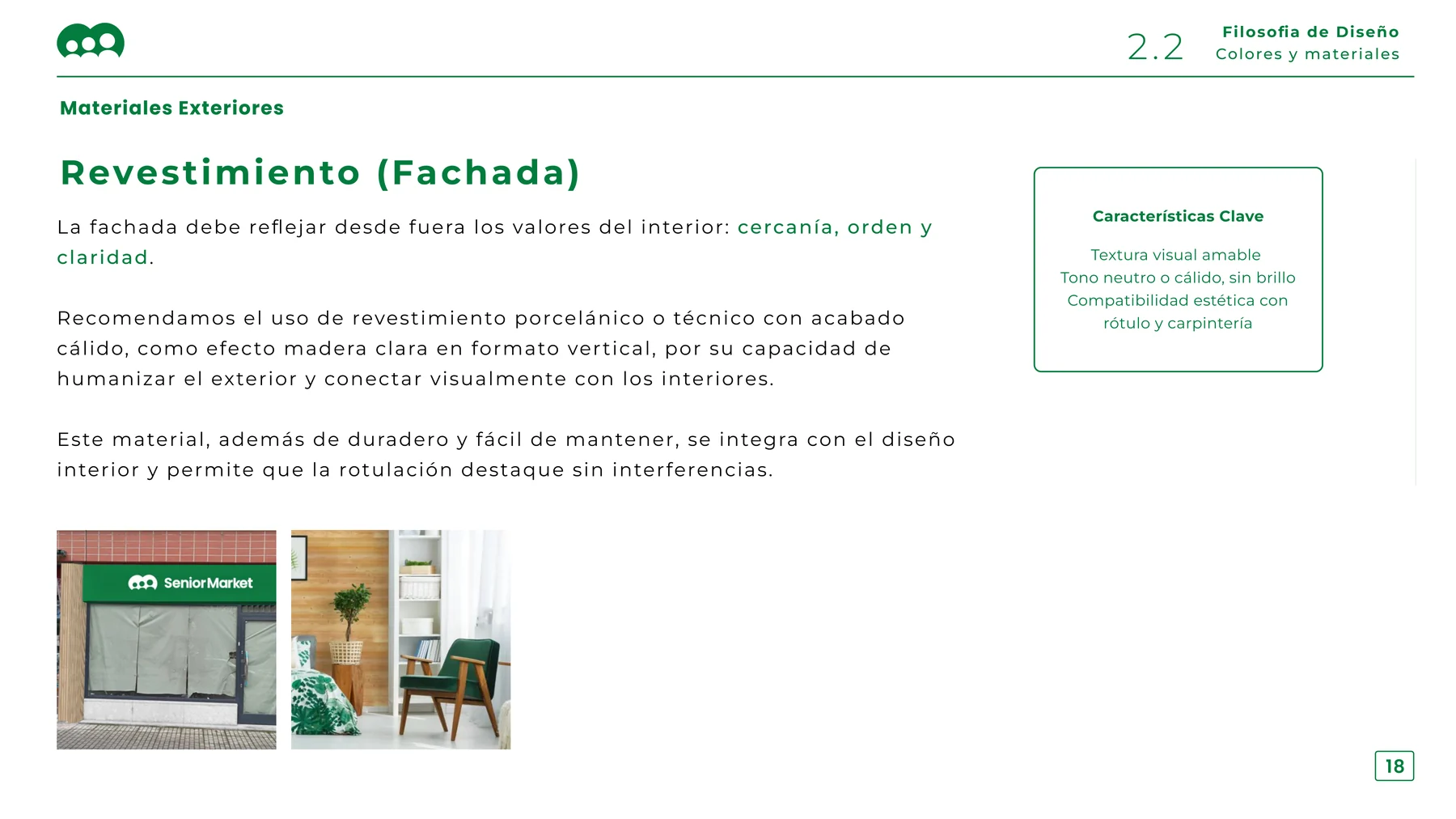
Exterior materials slide covering porcelain facade cladding with a warm wood-effect finish
Facade: warm wood-effect porcelain, durable and quiet enough to let the signage carry the message.
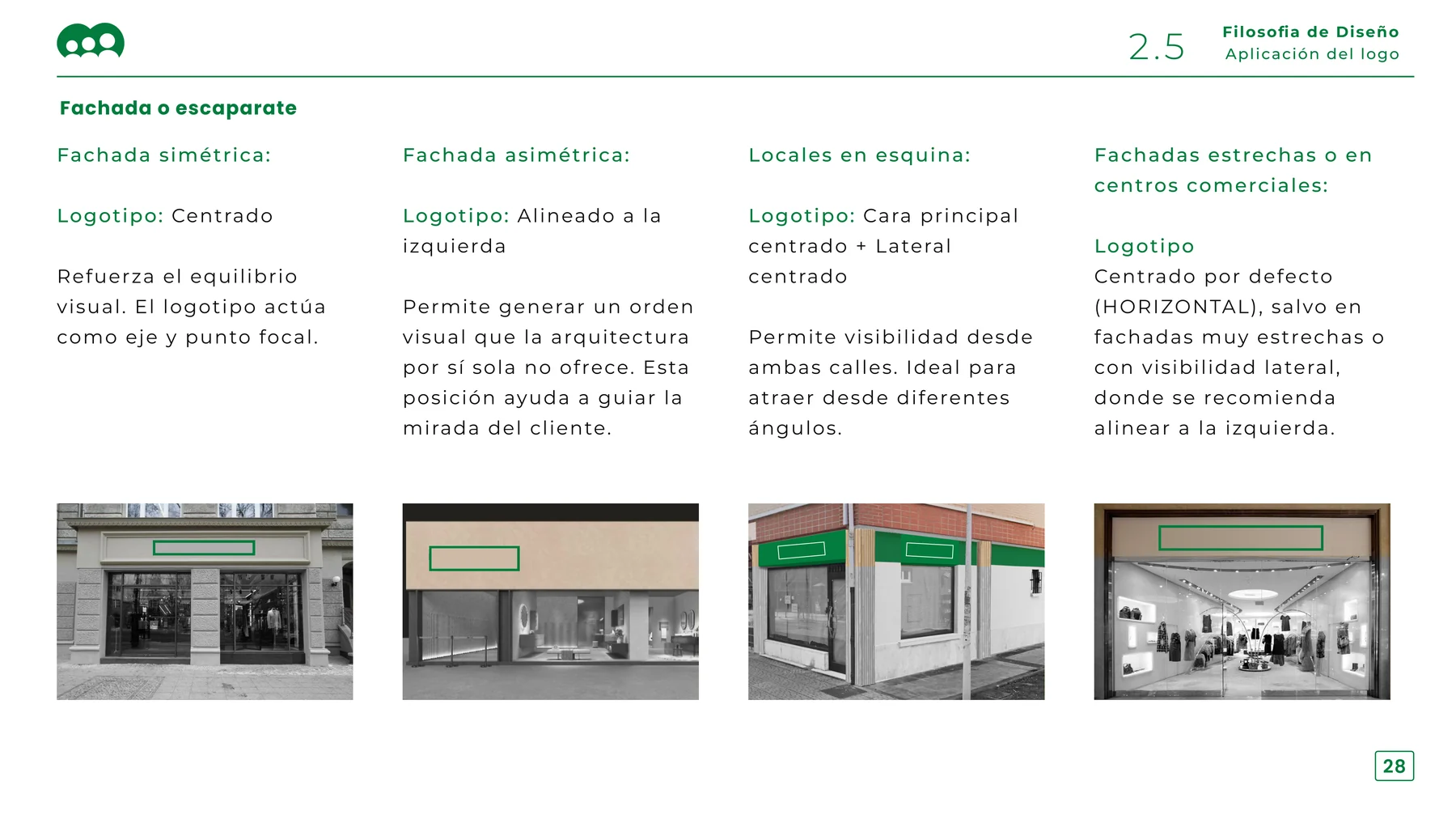
Storefront typology slide showing logo placement rules for symmetrical, asymmetrical, corner and narrow shopfronts
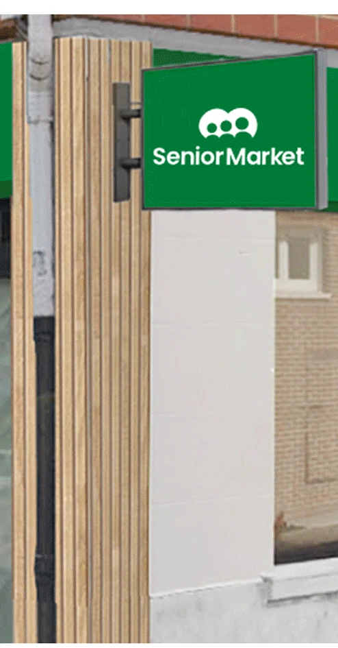
Four shopfront typologies, each with its own logo placement rule — symmetrical, asymmetrical, corner unit, and narrow or mall frontage. The alternative was letting each installer decide.
Green projecting blade sign with the Senior Market logo mounted beside a wood-clad shopfront
Projecting blade sign — the corner-unit rule in place.
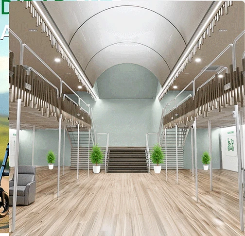
Store interior visualisation with a wide central aisle, sage green walls and light wood flooring
Interior: wide aisles, sage walls, short routes.
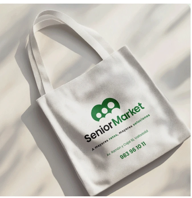
Natural canvas tote bag printed with the Senior Market logo, slogan, store address and phone number
Tote carrying the slogan and the store details.
05 / Advertising

One idea, four placements.

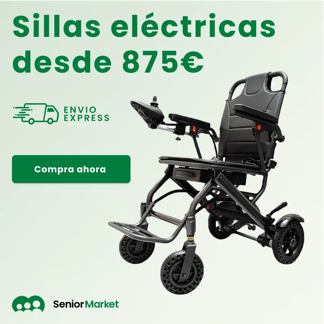
One offer, four aspect ratios. Rather than stretch one artwork, each was rebuilt: fixed reading order, layout reflowing around whichever edge is scarce. Pick a campaign, step through the formats.

Senior Market electric wheelchair campaign, square feed format

Square feed unit: headline stacked at the top, express-shipping badge and CTA down the left, product filling the right.

Sillas eléctricas · Price-led
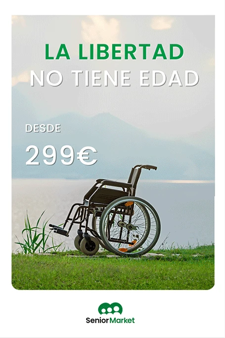
Print poster: La libertad no tiene edad, a wheelchair by a lake, from 299 euros
In-store poster — “Freedom has no age.”
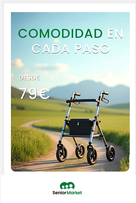
Print poster: Comodidad en cada paso, a rollator on a country path, from 79 euros
In-store poster — “Comfort at every step.”
Branded folding hand fan printed with the Senior Market logo and phone number
Summer giveaway fan — the isotype exception in practice.
06 / UX/UI and web

Designed for the person, not the buyer persona.

Two audiences — older adults, and the adult children buying for them. The same friction kept surfacing: small type, low-contrast controls, a catalogue sorted by product when people arrive with a problem.

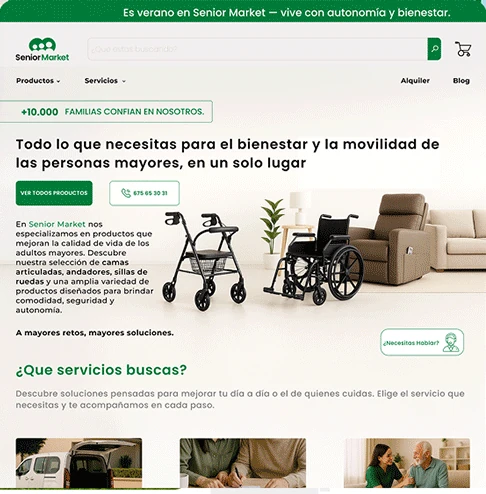
Senior Market storefront design: announcement bar, full-width search, families-trust badge, hero and a services section
Storefront: the “+10,000 families” badge sits above the headline, search is full-width and permanent, and a help prompt follows the page.
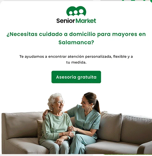
Senior Market lead-generation landing page for home care in Salamanca with a free-consultation call to action
Service landing page: one city, one question, one action. Built per location for paid campaigns, with the free-consultation CTA above the fold.
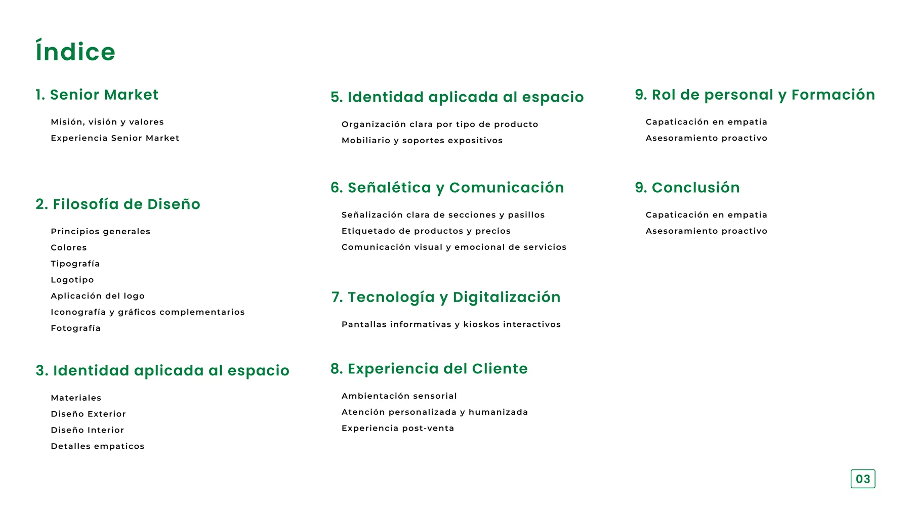
Contents page of the Senior Market brand manual listing nine chapters
The manual’s contents page — nine chapters spanning brand, retail space, signage, technology, customer experience and staff training. The identity was scoped as an operating system, not a logo file.
07 / Outcome

One brand, held together across very different rooms.

A manual specific enough for a shopfitter, a framework that yields four correct placements instead of one stretched one, and a storefront built around how this audience actually shops.

[08]Next project

Into something louder and more cultural.

Leave the calm marketplace system and step into an independent streetwear label built on attitude and control.

Hardcore Crew Streetwear · Brand · 2026 A streetwear identity built from attitude, discipline and visual control.
View next project
Back to selected work