← All work
Streetwear and clothing· 2026
Hardcore Crew
A streetwear identity built from attitude, loyalty and visual control — an independent clothing project, designed from scratch.
50+ Garments soldSelf-run drops, no retail partner
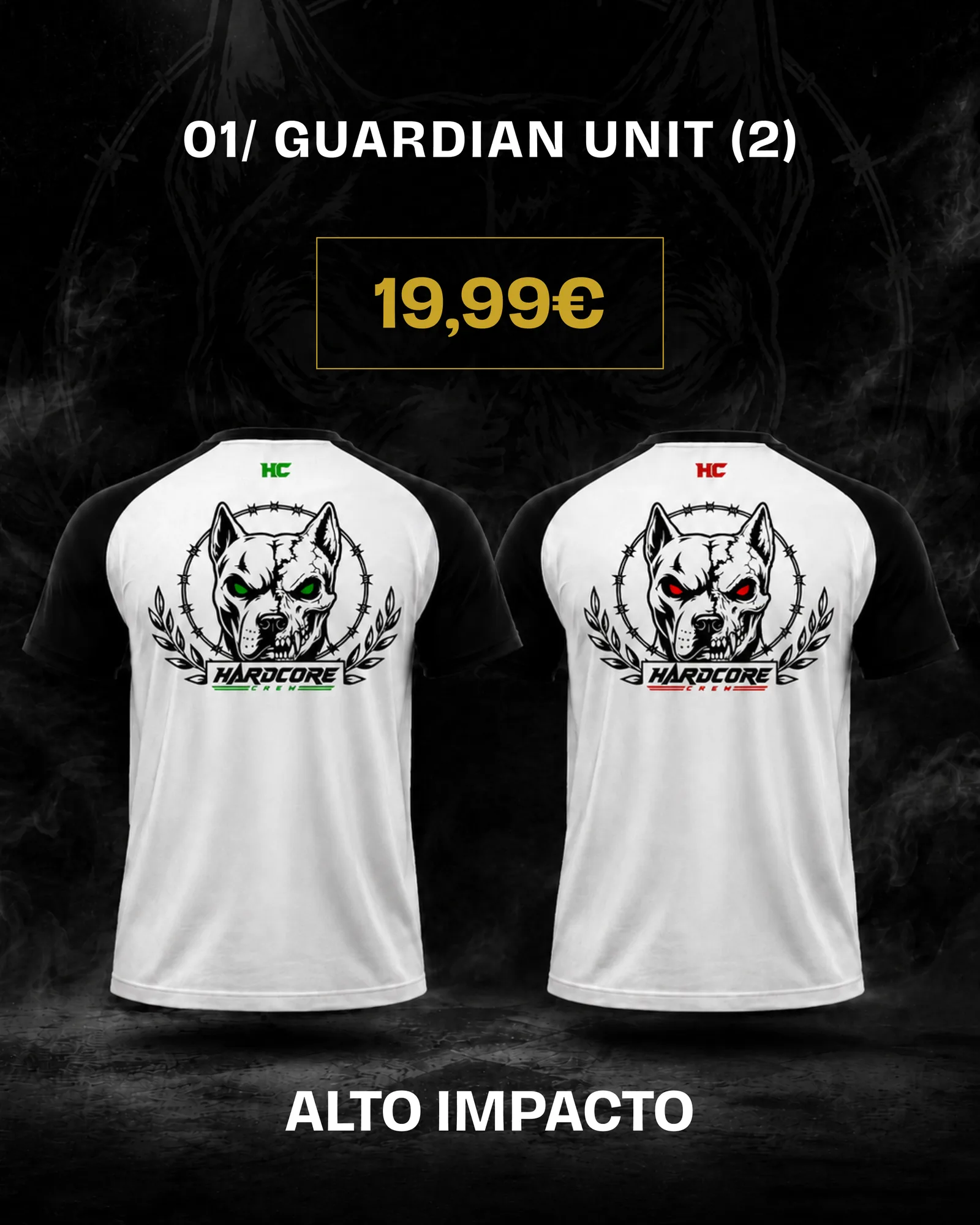
Full drop post — the raglan crest, live.
[02]Overview
A clothing project with a controlled attitude.
An independent streetwear identity with a direct visual language: bold type, controlled contrast, and graphics built to survive a garment.
An independent label I co-created in 2026 and still run — over 50 garments sold to date. Black, white and gold, heavy type, crest graphics and industrial campaign direction — a brand world that feels strong without becoming random.
I own the design side end to end: the mark and its lockups, the graphic element set, every product graphic and its placement on the garment, the campaign art direction, and the drop communication and digital rollout. The constraint that shaped it is print: a crest has to hold at chest scale, on black, through a screen-print, which rules out most of what looks good on a screen.
A visual language built for impact.
01
Logo system


Monogram and wordmark, from label to campaign scale.
02
Colour system
Black
#050505Base, garments, backgroundsWhite
#F5F5F5Prints, clean contrastGold
#D4AF37Accent, markers, emblem toneRed accent
#EF2B2DUsed sparingly on graphic linesBlack base, white for legibility, gold for value.
03
Typography
Hardcore
ABCDEFGHIJKLMNOPQRSTUVWXYZ 1234567890
Display for marks and launches, condensed for support.
04
Graphic elements

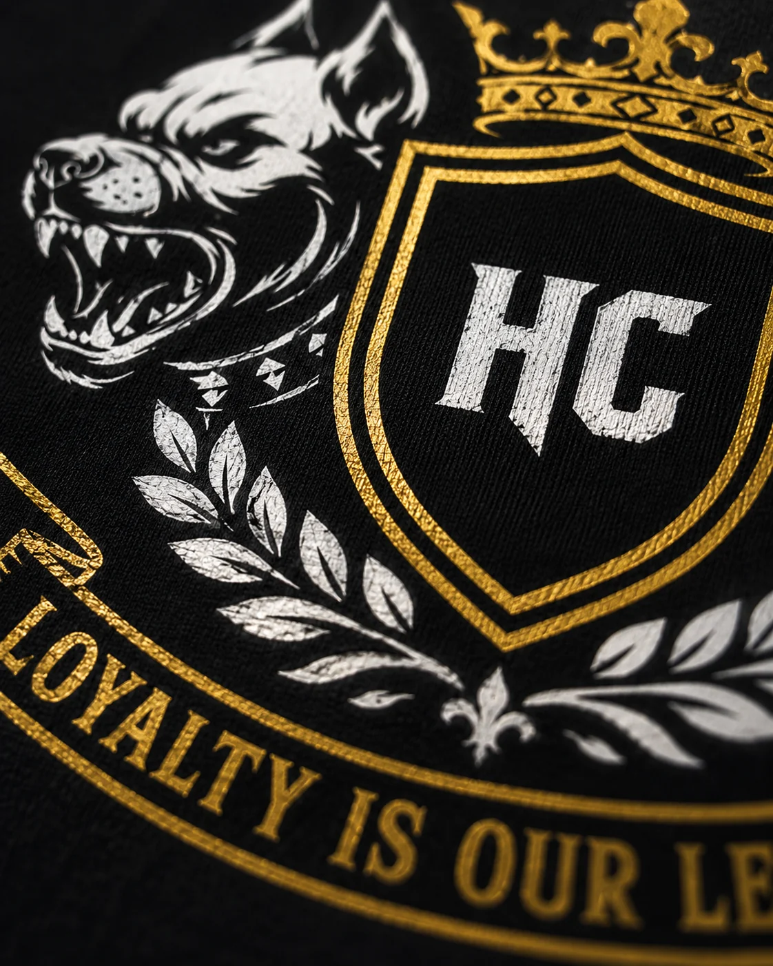
Crests, crowns, dogs, laurels, stars, chevrons.
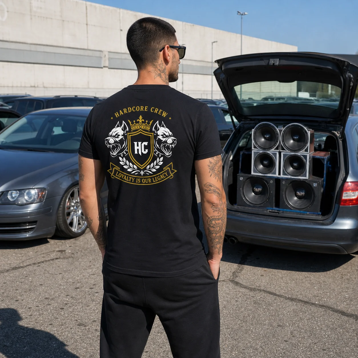
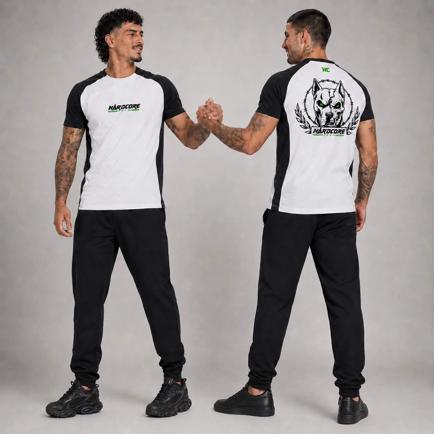
A drop that feels physical.
[05]Next project
Back to a concept world.
Move from Hardcore Crew's streetwear system into a speculative apparel concept built around climate responsive clothing.
WaveWear
Smart Fashion · Concept · 2025
Adaptive clothing concept exploring sustainability, technology and climate responsive materials.
View next project
Back to selected work