← All work

[01]Product · Brand · Founder-led· 2026

Adcompas

An MVP: AI reads your brand and your rivals’ public pages, tracks what changes, and turns it into a monthly report ending in three ad ideas. Identity, product and the Next.js build — solo.

Role
Founder · Brand & Product Designer · Builder
Type
Independent SaaS product
Year
2026
Stack
Next.js · Supabase · Playwright
Status
MVP · private beta, pre-revenue

[01]Overview

About the work.

An MVP of a simple idea: point AI at your competitors' public pages, and get back what changed, what your brand is missing, and three ads worth testing.

It's an MVP, and framed as one: private beta, pre-revenue, one paying plan defined but not yet a business. What follows is the design and the working build, not a success story.
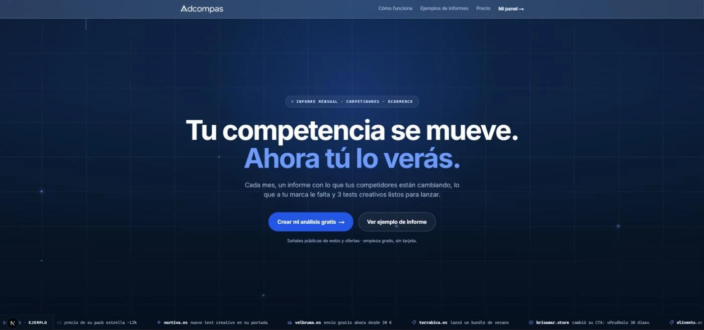

Adcompas landing page hero: a full-viewport navy signal field with the headline "Tu competencia se mueve. Ahora tú lo verás." and a live ticker of competitor changes
The landing page leads with the promise, not the feature list — and runs a live ticker of the kind of change the product actually catches.
The problem section of the Adcompas landing page: a centred headline reading Mirar la web de tu competencia una vez no sirve, above three cards naming the failure modes
Directly under it, the problem in three cards — each one a failure mode the product is answering, stated before any feature is named.
01Brand identity & voice system
02Onboarding UX flow
03A working Next.js/Supabase build
01 / Brand identity

A calm mark for an honest analyst.

It had to look like what it claims to be: careful, evidence-led. Desaturated neutrals, one signal colour — the discipline of an intelligence document, not an ad-spy dashboard.

01

Logo system

A pulse-line mark inside a rounded square, paired with a plain-spoken wordmark. No gradients, no mascots — it needed to survive being small in an email as much as large on a report cover.

02

Colour palette

Paper#F6F8FCDefault background of every marketing surface — whitespace as a brand asset.
Ink / navy#0B1F3AHeadlines, dark signature panels, report covers.
Action blue#4E7BFFCTAs, links, live signals — blue means something you can do.
Caution amber#B7791FDetected changes, low-confidence markers — used sparingly.
03

Typography

Aa Anton — display, §NN markers, prices Inter — body, UI and every heading

Two webfonts, on purpose. Anton reads like a newspaper masthead for section markers and big numerals; Inter carries everything else, including headings. No italics anywhere — emphasis comes from scale and colour instead.

04

Voice — "cercano e inteligente"

"Tu competidor bajó el envío gratis a 30 €. Quizá te interese saber por qué."

— real report copy, not "¡Descubre los SECRETOS de tu competencia! 🚀"

A documented do/don’t table for tone, so the voice doesn’t drift between the landing page and the report someone pays for.

02 / Reading the brand

From a URL to a report, with nothing to fill in.
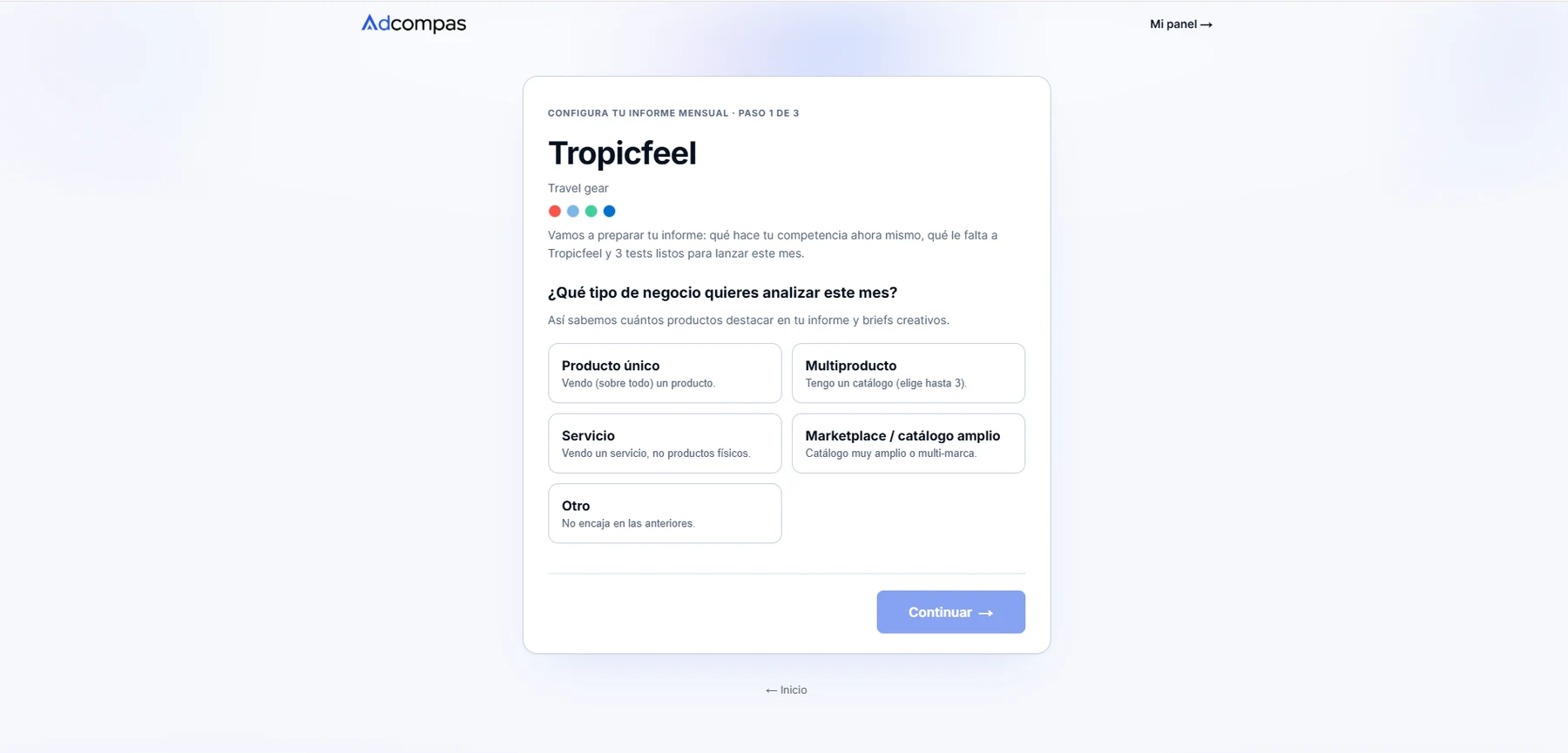
Paste a URL. The brand is already detected, competitors already suggested, analysis already running — before you’d normally finish a form. No card until there’s something worth paying for.

Adcompas setup wizard: the brand Tropicfeel already detected as travel gear with its colour palette read off the site, above a choice of business type
By the time you reach step one, the analysis has already run: name, category and palette pulled straight off the store. The only thing it asks is the shape of the catalogue — because that decides how many products the report highlights and how many briefs it writes.
01

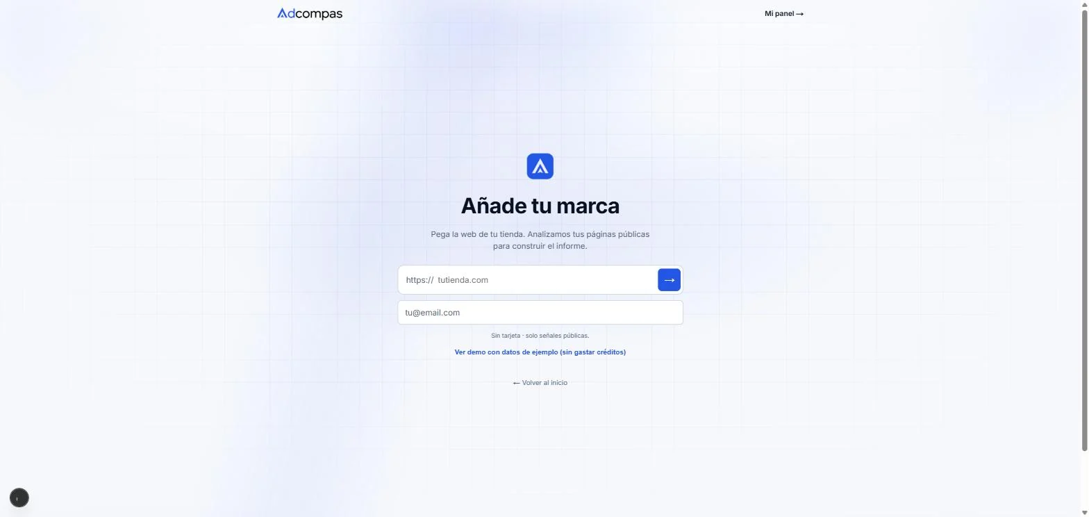
Añade tu marca

Adcompas onboarding step 1: paste your store URL and email, no card required

One field. No card, no account — just the store URL and an email.

02

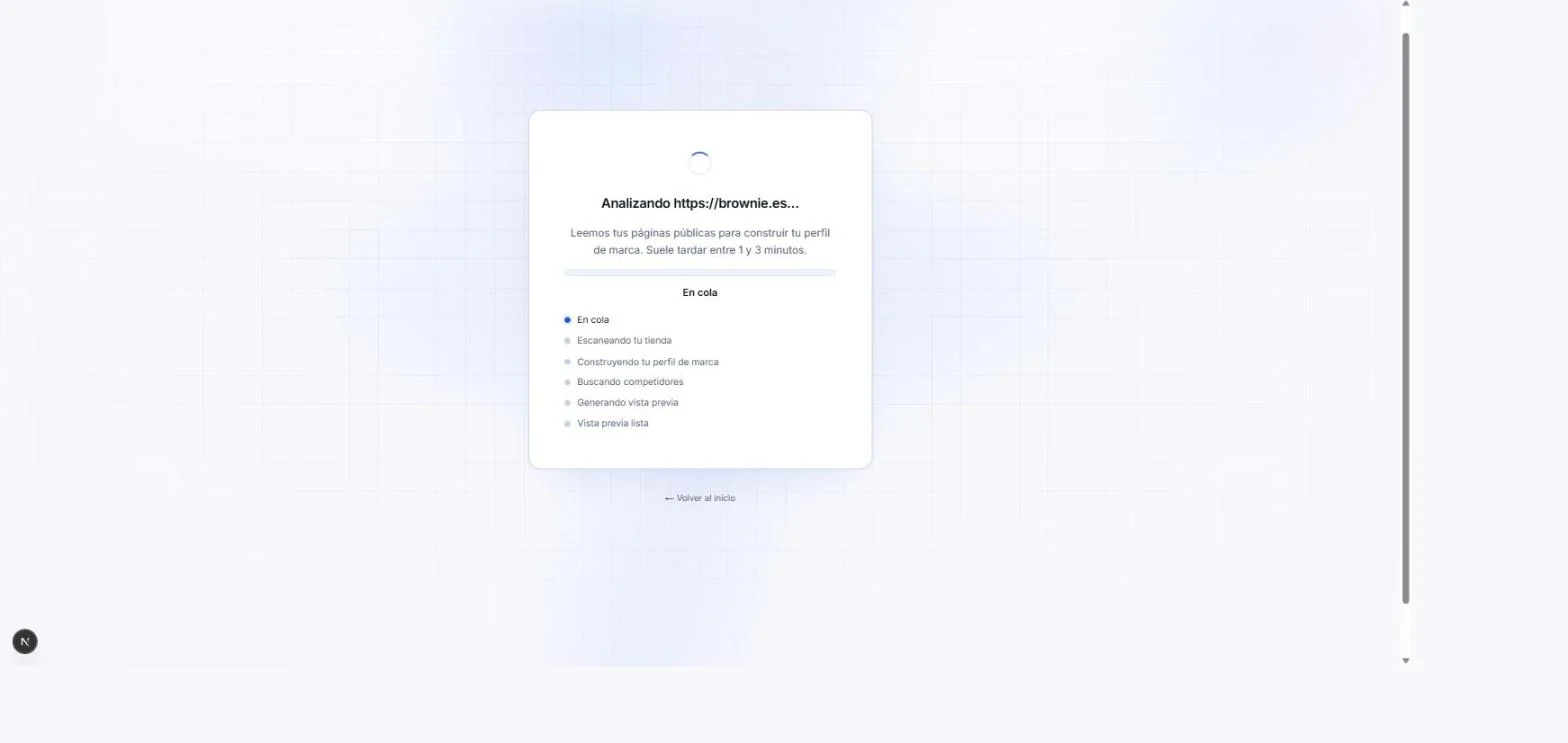
Escaneando

Adcompas scan progress screen showing queued, scanning and building-profile states

A real background job, with semantic status — never a spinner lying about what's happening.

03

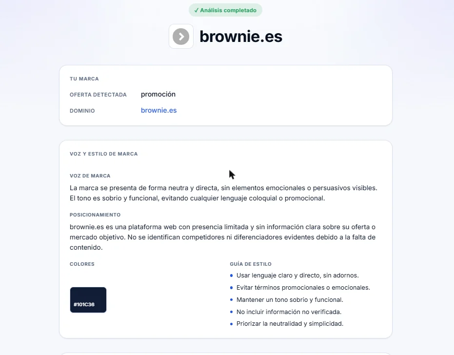
Voz y estilo detectados

Adcompas preview screen showing the detected brand voice, positioning and colour

The no-hallucination rule, visible in the UI: thin signal reads as "presencia limitada," not a padded guess.

04

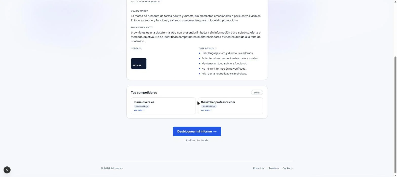
Desbloquea tu informe

Adcompas paywall screen with the unlock-report call to action, after the brand analysis is already shown

The paywall shows up after the product has already proven it read the site — not before.

03 / What it watches

A panel that shows its working.

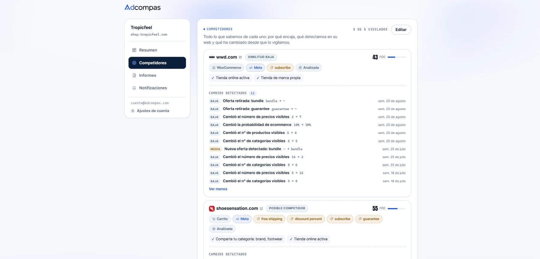
Every competitor scored out of 100, tagged with what was actually detected, and logged week by week. The hardest thing to design honestly.

The Adcompas private panel showing five monitored competitors, each with a similarity score, detected-technology tags and a dated log of changes graded low or medium
Five competitors watched, each scored and tagged, with eleven changes detected on the first alone — offers withdrawn, price counts moving, a new bundle appearing.
04 / The report — an adaptive engine

Same engine, different visual voice.
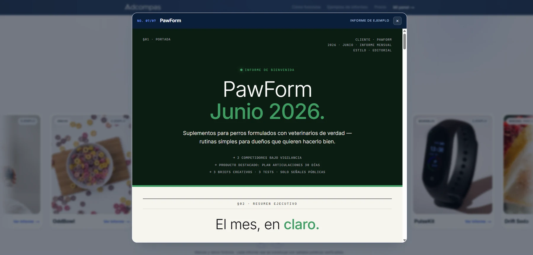
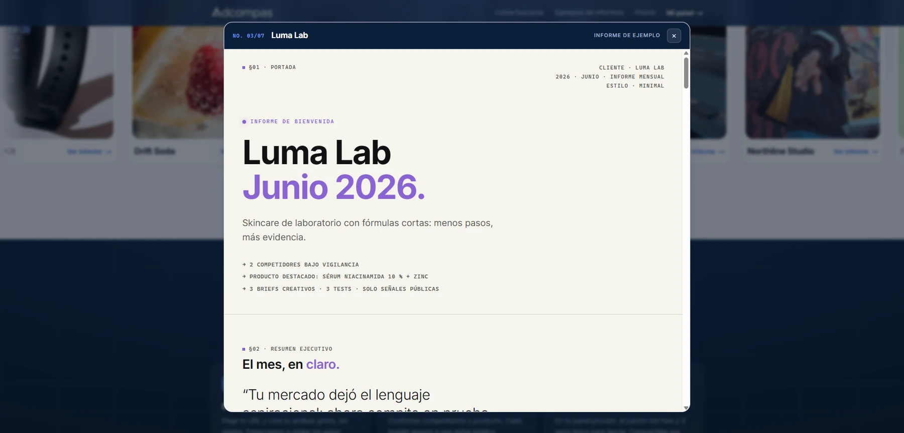
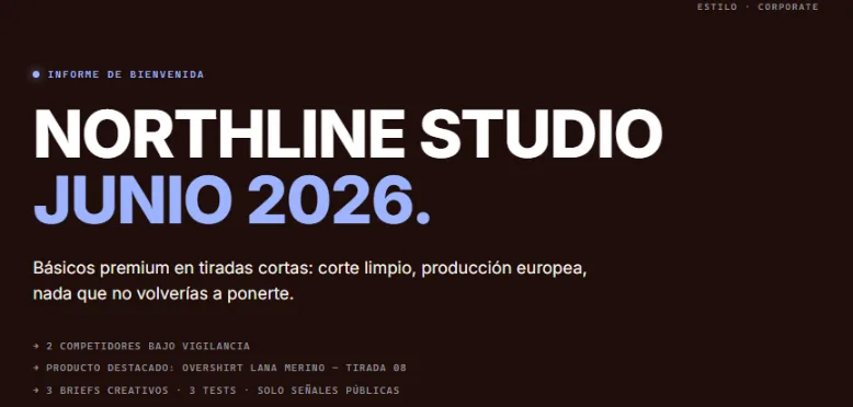
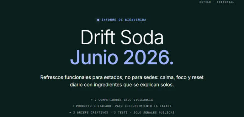
Every claim carries a confidence score and an evidence ID; unsupported ones render as “no detectado”, never a guess. On top of that, each report reads the client’s own brand and swaps visual register — same sixteen sections underneath.

Adcompas report for Luma Lab opening in the reader, set in a minimal register with a violet accent
Luma Lab — minimal register: violet accent, tight sans, plenty of air. Read in the browser, one report of seven in the example set.
Adcompas report for PawForm opening in the reader, set in an editorial register with a deep green masthead
PawForm — editorial register: deep green masthead, centred serif-ish display, warmer paper. Same sixteen sections underneath, same § numbering.
Adcompas report for Northline Studio: a near-black masthead with heavy flush-left caps and a periwinkle date line
Northline Studio — corporate register: near-black field, heavy caps set flush left, periwinkle date line.
Adcompas report for Drift Soda: a deep green masthead with centred display type and a periwinkle date line
Drift Soda — the same editorial register read differently: deep green field, centred display. Four brands, one engine.
05 / Pricing & positioning

Calm pricing for an honest product.
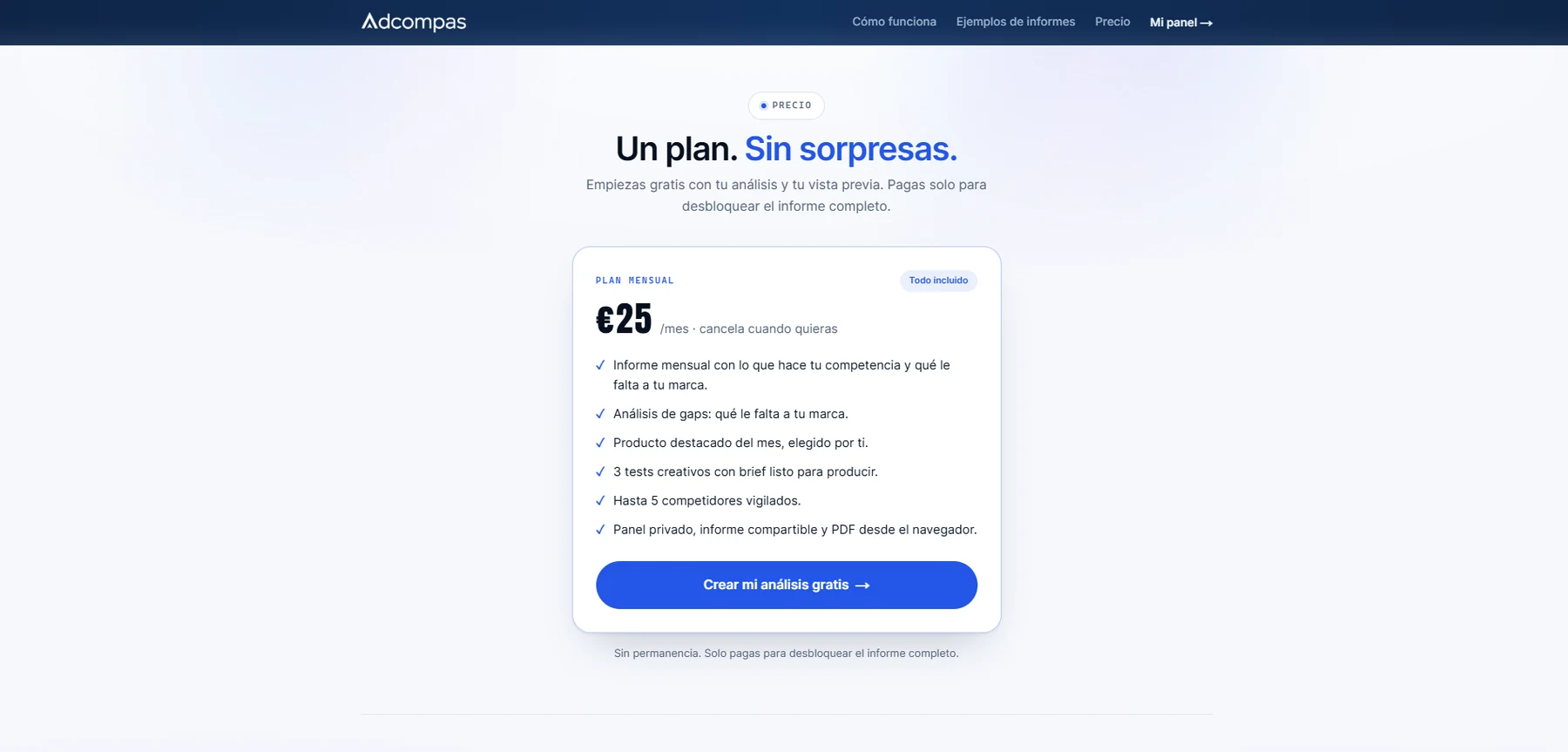
No fake strikethroughs, no countdown timers. The price sits flat, in tabular numerals, next to deliverables rather than adjectives.

Adcompas pricing section: a single 25 euro monthly plan listing six deliverables, with a free-analysis call to action
One plan, stated plainly — "Todo incluido," cancel whenever.
06 / Role & process

Designer, copywriter and builder, in that order of stakes.

Solo, end to end. The design only meant something once it was load-bearing in a running product — so I built it, rather than comping it.

  • 01

    Brand identity, from mark to a documented voice-and-tone kit used across every surface — including the report a client actually pays for.

  • 02

    Product & landing UI, including the theming system that adapts the report's typography and palette to each client's own detected brand.

  • 03

    All product copy in Spanish, written to a "cercano e inteligente" register with an explicit do/don't table — nothing left to drift page to page.

  • 04

    The technical build: Next.js and Supabase, a Playwright scraping worker, Stripe Checkout, and an OpenAI Structured-Outputs pipeline under a hard no-hallucination rule.

A zero-spend rule shaped the brand as much as any mood board: free tiers only, pay for a tool once a client covers it. Restraint wasn’t the compromise — it was the point.

[02]Next project

From a SaaS product to a streetwear world.

Move from Adcompas's product and brand system into Hardcore Crew's full identity and drop system.

Hardcore Crew Clothing · Brand · 2026 A streetwear identity built from attitude, loyalty and visual control, across brand identity, clothing graphics and a drop system.
View next project
Back to selected work